KNMI
Lockdown air pollution
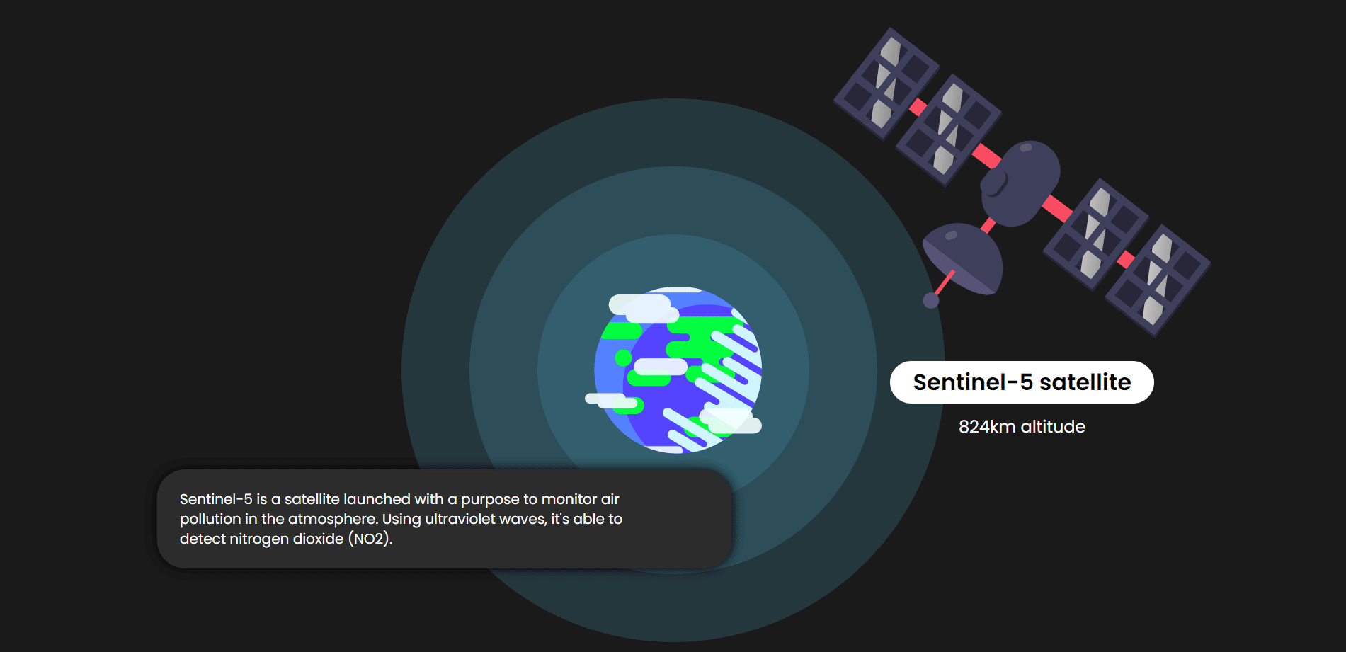
How lockdown measures in Europe and Asia changed nitrogen dioxide emissions.

LOCATION:
WORK
//
KNMI
My role
UI/UX/Front-end - Worked together with a team that consisted out of four teammates
Worked on
Desk research: Gathering data such as wind direction, COVID-19 measures and cases. Doing research as to how we can design our solution for the target audience.
Prototyping and concepting: Testing different ideas with the client together with the team and reiterating the concept. The concept was coded in HTML/CSS.
Design Guide: To keep the design consistent, I made a small Design Guide that shows which colours and font sizes should be used when the site is built.
HTML/CSS: I helped coding the front-end of our website.
Type of product
Datavisualisation on a website working on a Javascript framework (Vue).
Description
For one of my semesters I was following a course on Information Design. In this course we learn a lot about datavisualisations. We learn how they work, are applied and when they should be applied. In this course we had the KNMI as our client.
The KNMI provides reliable and consistent measurements, data and forecasts that form the basis of important decisions that keep the Netherlands safe. From a code red for road traffic to the climate scenarios for the Delta Program, involving billions of euros, for a safe Netherlands that is prepared for the impact of weather, climate and earthquakes.
Design Challenge
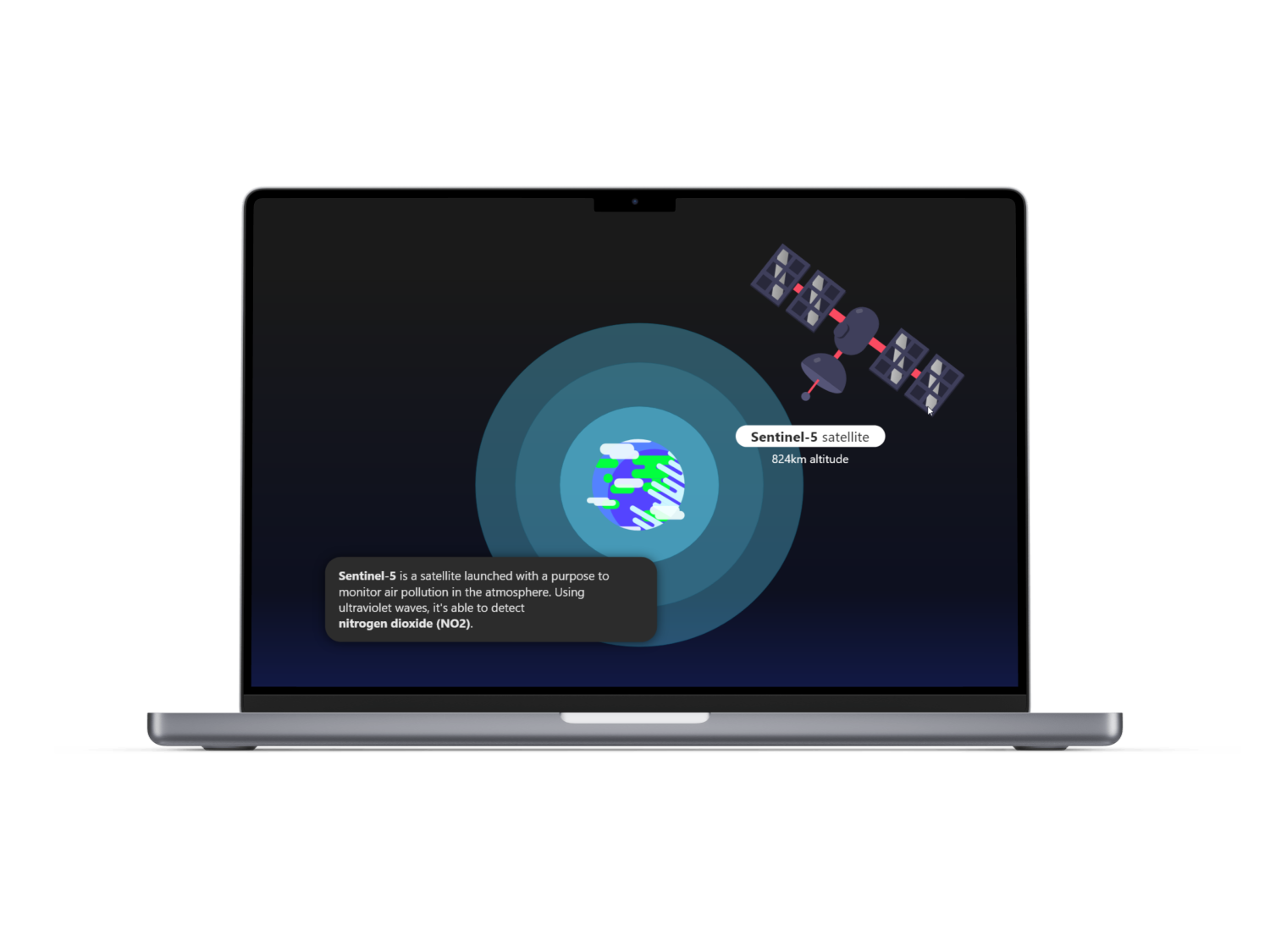
What consequences has the coronavirus had on the air pollution of our world? In what way do we show in an interactive way how changing collective behavior can reduce air pollution?
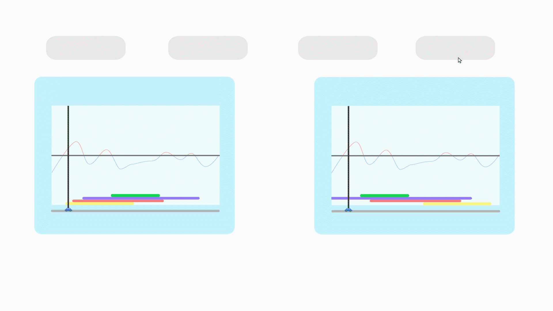
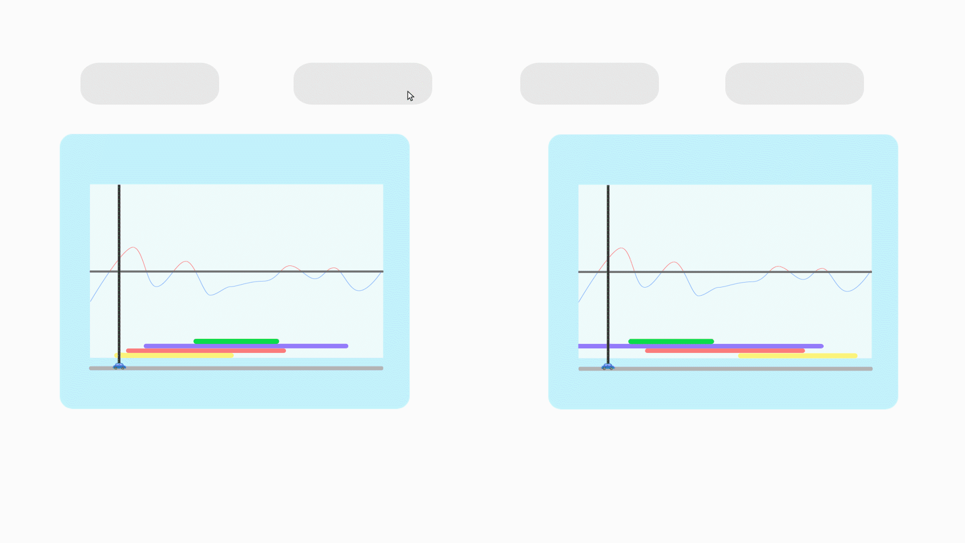
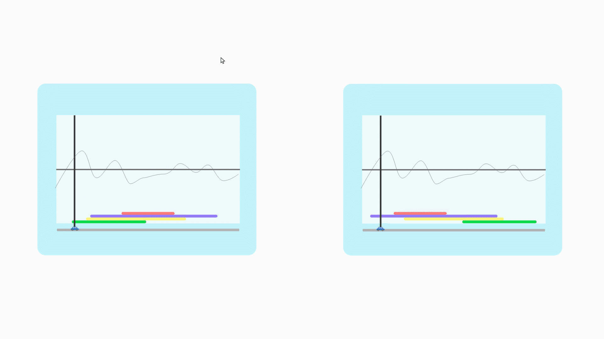
The solution
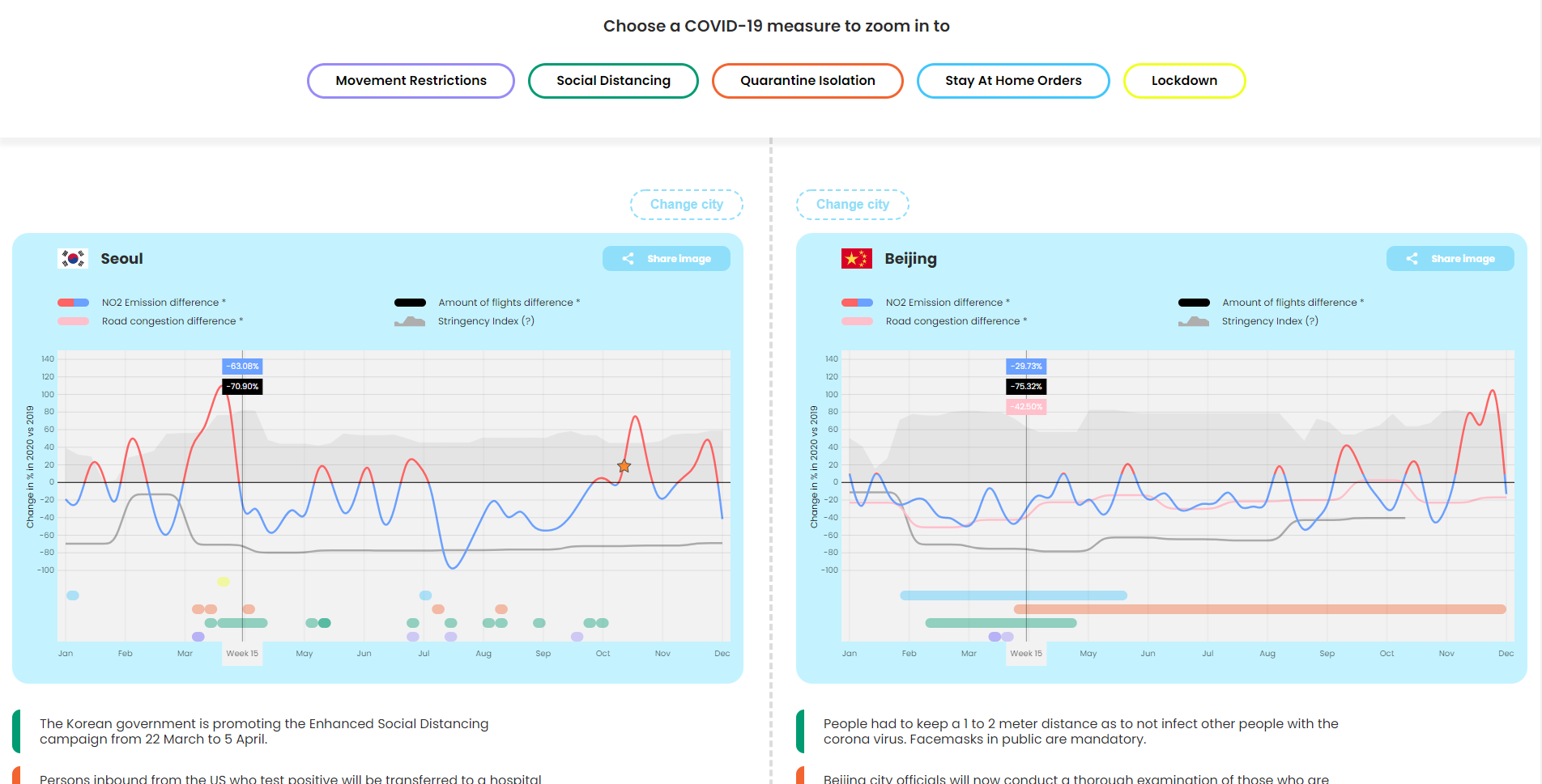
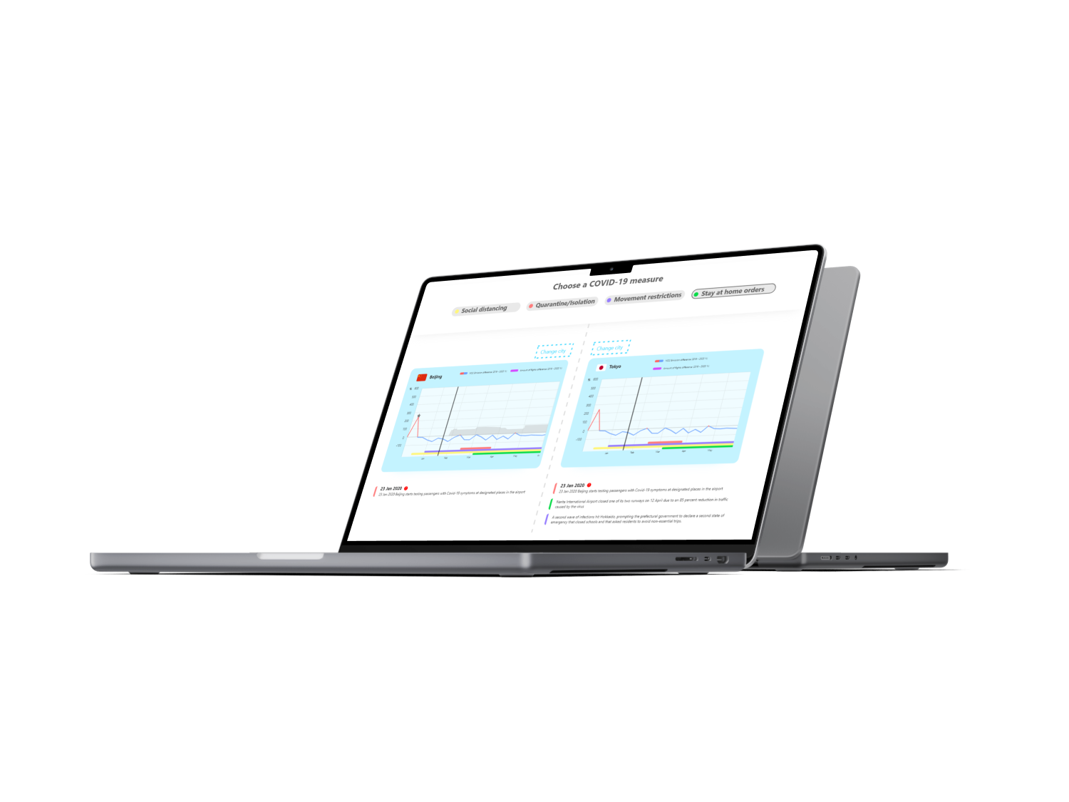
We made a tool where you can compare countries' COVID-19 measures against each other. Due to the limited data we collected, we only had information about a small number of countries in Asia and Europe. When you hover over a timeframe, you will see which COVID-19 measure was applied. Aside from seeing it when hovering, there are also bars at the bottom of the visualisation that show you how long a measure lasted. Since this is a quite complex tool to use, we also designed a tutorial section before making use of the datavisualisation.
The design
We wanted to create a look and feel just like the video's from Kurzgesagt. It is aesthetically pleasing, but has also a very clean kind of design that doesn't distract the user a lot. In our first half of our website we wanted to make it look a bit more playful. When you scroll down and dive into the details, we focused on giving the design a more clean look so that the user can focus fully on the content. We designed a quite complex datavisualisation so helping the user to understand how it works is an important design decision.